Herman Au Photography

My photo
Welcome to my blog! I'm a professional wedding photographer based in Los Angeles California. Follow my footsteps in turning my life long hobby into a career I love, and check out my latest work, newest products, teasers, and photography tutorials. I shoot in an unobtrusive photojournalistic style with an emphasis on natural and genuine emotions. You can find my portfolio on my website - http://www.hermanau.com.
Showing posts with label tutorial. Show all posts

Sunday, February 22, 2009

Windows Color Management, Lightroom 2, Windows Pictures and Fax Viewer, and Color Calibration...

Alright, I'll admit I'm not as familiar with color management as I'm supposed to be, and there really isn't a lot of ways to get around it without digging deep into the technical aspects in understanding how it all works. I got myself a new 24" LCD a little while ago, and set the old failing Dell 20" monitor on the side as a secondary monitor. I thought I was done after calibrating the colors on the monitor, but only later found the colors of some of the images didn't come out accurately. I figure I wouldn't be the only one running into this kind of problem, so here I am, sharing my findings.

In my situation, there were lots of things that could contribute to the problem because there were too many ways for adjustments.
  1. Monitor color settings (and ambient light sensor which I turned off 'cause I wanted consistency, not something easy on my eyes)
  2. ATI Catalyst Control Center... yikes, you could change color temperature, hue, saturation, brightness, contrast, and even gamma. Mind you this is done with the software that came with the video card, and this goes on top of native Windows Color Management controls.
  3. Windows Color Management (Control Panel - Display - Settings - Advanced - Color Management for XP, sorry Vista folks, do your own homework)
  4. On top of all that, my ColorVision Spyder2Express that calibrates the monitor.
In order to save you some reading time, I'm skipping all the diagnostics and the story behind how it all went south in the first place. Anyhow, I noticed the colors in LR was entirely off comparing to the same images viewing in Windows Picture and Fax Viewer & Firefox/IE. You'll find plenty of people having similar issues on the Internet, and believe me it's a pain to try to resolve these.

First things first, I reset everything in ATI Catalyst back to default just to avoid confusion. I wanted Catalyst to have no part in dealing with my color calibration. Once I reset everything and made sure the program isn't managing my colors in any way. The moment I clicked OK, the colors of my monitor immediately looked terrible, and I knew that Catalyst did something behind my back...

Next up, I went into the Menu on my HP monitor, and set the colors back to default, restarted my computer after yet another calibration. Colors looked OK, but still off from what I see in Lightroom. Then I noticed the little program that starts up along with Windows that quickly fades during the boot up sequence. I started questioning what that thing does, because I manually assigned the .icm I calibrated in Windows Color Management already. After a little research, I found that Lightroom works differently than the rest of the programs in Windows... according to Adobe:

"Lightroom simplifies color management in your photographic workflow. You don’t need to choose color settings or color profiles until you are ready to output your photos. To take advantage of Lightroom color management, you need to calibrate your computer monitor so that you are viewing accurate color."
So basically, as long as your monitor is calibrated properly, Lightroom will display colors accurately and there are no color management settings in LR to fumble with. According to Adobe, Lightroom assumes sRGB profile for file rendering and Adobe RGB library module previews. I then went into Windows Color Management, and instead of using the customer Spyder2Expess.icm color profile I set previously, I changed it to sRGB Color Space. Then I reset my computer once again, and ran color calibration one last time - whola! Suddenly the colors of the 2 programs are matching!

That's it?

Nope...

Apparently Windows Color Management assigns an .icm profile to the display monitor, but that does not assure the programs that are shipped with Windows XP or your image display program like Windows Picture & Fax Viewer would play nice with color profile. Why? For starters when you have Adobe Lightroom which plays nice with your calibrated monitor and monitor color profile and displays things properly simply will not match the colors you see with the same image with Internet Explorer or Windows Picture & Fax Viewer 'cause neither programs recognize embedded ICC profiles. It would automatically assume the default color profile - your calibrated monitor profile to display the image you're trying to view. If you're trying to view any regular sRGB or aRGB image with that, yikes... it will look all messed up just like this:
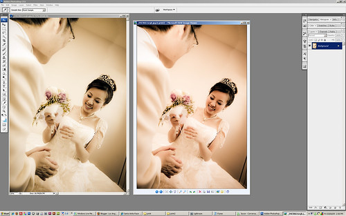

icm_test1 (by hermanau)

So which one is "correct"?? It's actually the one on the left which looks whacky greenish. Yep, that's right... I took the screen shot with the windows printscreen feature, and this tells you that Windows "thinks" I'm seeing correctly as the one on the right, but in reality I see something VERY RED on my calibrated monitor. Anyway, the important thing to notice here is that I'm viewing a correct image on the left, while Windows is displaying wrong on the right; but when I printscreen, Windows returns the "correct" colors on the right, while the left now becomes wrong in the other direction - green.

To confuse (clarify) you further... here's the original image exported from LR to sRGB displaying properly: *note that you may not even see a difference if you don't have a calibrated monitor*

_DSC0661srgb (by hermanau)

If I view this image in Safari for Windows or Lightroom which reads embedded color profiles, they display properly on my calibrated monitor. If I view this same image with Internet Explorer however, it will look WAY OFF.

I think I lost almost everybody already, but if you're still reading, congratulations... here's the lesson learned:

  1. The majority of the monitors out there are NOT calibrated.
  2. The majority of the images on the Internet are untagged sRGB, which should display rather accurately if you export your images in sRGB.
  3. Color Calibration is NOT for everyone, especially if you do wish to give yourself a headache unless you absolutely have to. It is mostly important for photographers, graphic designers, or the likes to ensure their images come out properly at printing.
  4. If you calibrated your monitor, and you notice Windows Pictures and Fax Viewer showing different colors to Adobe Photoshop, Adobe Lightroom, Safari, or Mozilla Firefox running with proper Color Management, read this straight: it is normal. You just have to deal with it and understand the limitations of those programs and learn that they're not to be trusted in terms of color.
  5. Color Management is not fun at all... again, if you don't have to deal with it, even if you have too much money to spare on that pretty Monitor Calibration tool, make sure you are ready to tackle a huge confusion before you buy that cool gadget for pros.
  6. If you don't fall into the pros group who absolutely need color manangment, take my advice - don't play with the color settings on your monitor! I know your new expensive monitor has many pretty controls that let you play with them, but again, do NOT play with them. Windows will not know your monitor settings are off, sRGB will be off, even Lightroom wouldn't know it's displaying on your whacky monitor and all your pictures will come out whacky on everybody else's monitors. Just don't touch them, stick with sRGB, and be happy that you have one less trouble in your life.
That's it folks, I hope I have scared off enough folks and managed to explain enough details and shared enough experience with those who are in need. Until next time...

Reference: http://www.gballard.net/photoshop/srgb_wide_gamut.html

Monday, August 18, 2008

Delia Photoshoot

We've been planning on this shoot for several weeks already... with limited budget and experience and a lot of uncertainties, we went ahead with this photoshoot last Saturday. It took a little while til we all warmed up and had the lights, reflectors, and everything else figured out properly to get the effects I was hoping for, but I think the whole experience was well worth the effort. We only used a simple setup mainly using the AB1600 as the key light varying its position. I also added a hair light with an SB800 behind the model up high, and on some shots I added a catch light laying on the floor. I had a large reflector on the opposite side as fill, and I also varied the position and angle of it on some shots.

Next time I think I'll set up my D200 in time lapse mode... but anyway, this video was taken somewhat randomly with a remote. It does give you an idea how the whole thing was done. Hope you'll enjoy it as much as I do. :)


Big thanks for Delia modeling for us and really appreciate Bernard providing his garage and the Alienbees strobe making this possible.

_DSC_6303 copy (by hermanau)

_DSC_6295 copy (by hermanau)

_DSC_6274 copy2 (by hermanau)


_DSC_6339 copy (by hermanau)

_DSC_6107_001 copy (by hermanau)

_DSC_6150 copy (by hermanau)

Friday, March 21, 2008

Choosing Macro Lens

I stumbled across a post in strobist forum on flickr earlier which somebody asked for advice in choosing macro lens while she had the Tamron 90mm in mind. Just thought I'd cross post my response here since this might benefit others who may be interested in the subject and elaborate a little. Below is my post:

Be advised... all 3 versions of these 90/100/105 versions of macro lens made by Sigma, Tamron, and Tokina are non-internal-focus lenses. You'll notice the barrel moving in and out and takes a little while for the barrel to travel. Focusing with these macro lens even with the built-in focus limiter would be slower than normal lens or the Nikon/Canon internal focus versions. This down side magnifies into a much bigger problem if you're shooting under low light conditions or subjects that's hard to focus because it would take forever for the lens to hunt back and forth to lock the focus. Manual focusing ain't easy either if your subject is in motion.

If you're looking for a special effect lens or want to explore the macro world, you wouldn't be disappointed with the sharpness of all 3 flavors no matter which one you choose. However, keep in mind that the focus speed would pose problems when using them as "walk-around lenses".

Note: I find myself sticking the with 50mm F/1.8 more than whipping out my Sigma 105mm F/2.8 for closeup shots, and almost only use the macro lens for what it's made for - macro.
Frankly, if I were to choose all over again, I might go with the Tokina regardless of image quality 'cause all 3 flavors are extremely sharp. And for the 2 lenses I have purchased with Tokina - 12-24 F/4 and 16-50 F/2.8, I frankly have nothing but praises for them especially with the smooth operation and build quality. But of course, if budget isn't in the equation, I would absolutely go with the Nikon AF-S 105mm IF-ED VR. The added cost goes towards the Nikon quality, great customer service/warranty, internal focus, Silent Wave Motor (SWM), and Vibration Reduction (VR). All these would make the lens MUCH more usable and desirable on the field. But for now, my Sigma 105mm F/2.8 does the job just fine. :)
More on this subject later, and I'll be writing a little more in depth in gear selection next.

Sunday, November 25, 2007

Flickr Explore Tips and Tricks

I joined flickr for about half a year, and have 57 pictures on Explore (71 as of Mar'08). I once strategically made a few of mine to show on Explore... although I can't force them to get up there, I do have a pretty good idea how it works. Here are some pointers and cruel truth about it:

#1. Faves, Comments, and Views are basically the things that account for the positive score (interestingness) that count towards Explore.

#2. Adding to groups account for negative points (interestingness penalty) .

#3. Source of views/comments/faves matter; and the person who views/comments/faves your picture also matters. e.g. A newbie who just signed up today without an icon and has 0 pictures in the stream is worth less than hermanau for example, giving you a fave. Also, getting 1,000 views from outside links probably give you different scoring as well.

#4. Repeated comments from the same person are not worth as much as comments from different sources, if not actually penalizing the shot itself. Think about it, some people use certain pictures to carry on discussions. Explore has to screen those out...

#5. Joining many groups, and leaving the groups and rejoining tactics simply don't work... trust me it doesn't. This shot on the right was submitted to too many groups after Explore dropped it the first time, and it never made its way back regardless of how many views/comments/faves I got afterwards. It just lost too much grounds to be covered.
*note* months after I wrote this post, the picture on the right received a much needed boost of visit, and I finally regained enough to make its mark on Explore, proofing my theories are quite accurate.


Now that pretty much sums up the basics of the scoring system... note that if you place your shot in too many groups to begin with, your shot better gain a huge flow of traffic and faves, or else it will never cover the lost grounds and make its way up to Explore. How do you get the views/faves without adding to too many groups you say? Yea that's what makes it difficult... I'll sum up a few points here:

A). Sex sells. It's universal... a picture of a very pretty person will definitely have it easier than a picture of your living room. But beware, R rated pictures that are marked would probably be removed, or you may be penalized...

B). If you're a female with a pretty picture as your icon, congratulations... you'll have an easier time than me, or Joe next door... :) Flickr is pretty much web 2.0... and it's a social network. Like I mentioned above, since views and faves matter, you might notice that certain types of people get it easier than others due to obvious reasons.

C). Your subject matters. Some subjects have it easy because they draw people to click on the thumbnail to view a larger size. Our curiosity always gets us, because a bigger picture and the full details are just a click away.

D). Pictures with really eye popping effects or stunning visuals or jaw dropping elements always work. People would also generally fave those shots because they'll want to be reminded of the originality or the technique. Be generous and share the details behind your shots, because it helps others and also provide your viewers a platform to discuss, resulting in comments.

E). Get your shot technically right - Have it properly exposed, color balanced, focused correctly, etc. I don't think we need to go too far on this topic, I'm sure you all know this is important.

F). Be truthful to yourself. If your shots really aren't as good as those up there on Explore 500, maybe you need to improve before trying to push them up on the list.

G). Build up your contacts and social network, because those who like you or appreciate your shots would usually be kind enough and come back and view your latest work, and possibly earn your more views/comments/faves.

H). Yes, there appears to be a time zone on Explore. Afterall flickr is a worldwide network. From what I've heard, it is based on Pacific time zone, but I find flickr updates many times every day and so it probably doesn't matter when you submit your shot really.

I). Don't underestimate your tags, descriptions, and titles. They are the fields that allow your shots to be found when people use the search feature. That's one good source of allowing people to find your shots among thousands and thousands of pictures uploaded to flickr every second. Also, keep your pictures well organized, and navigation-friendly.

Finally, let me add one last thing to wrap this up... Flickr is about Photography, please be kindly reminded of that. Although I know you all want your shots to be listed on Explore or gain some publicity, it's also very important that Explore maintains the level of quality. So far I think it's got a very good algorithm in picking interesting shots. If you really want to make your way there, here's basically what you should do:

Improve your photography; learn how to positively critique; learn how to LISTEN to comments and critiques you receive; learn to appreciate great work of art; generously, nicely, kindly, and genuinely comment on others' work; be original, work hard, and enjoy the process.

Tuesday, October 02, 2007

Wine Bottle


Wine Bottle, originally uploaded by hermanau.

Thanks to Strobist.com, Flickr, and web 2.0 helping me solve a lot of reverse engineering puzzles in my head. With the limited resources, some very wacky setup, and the recent addition of some cheap umbrellas, I was able to produce the type of product shots I've long wanted to attempt. This shot of wine bottle is one of the examples that shows you everybody can do it... well, almost. :)

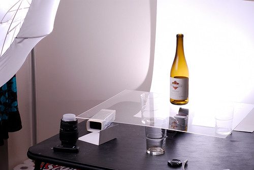
This is shot with my Nikon D200 with Nikkor 50mm F/1.8D hand held @ F/9.5 1/90sec. It's lit by 2 SB600 speelights - one below the bottle that sits atop of a piece of transparent Plexiglas, and a second one left of the camera shooting through an white umbrella. Background is simply a piece of poster board I bought from Office Depot. A picture speaks a thousand words, see the setup below.

Wine Bottle setup (by You)


Stay tuned - I'll demonstrate how I did some of my black background images next. :)

Thursday, June 07, 2007

Tutorial - Abstract Smoke Art

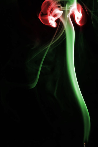
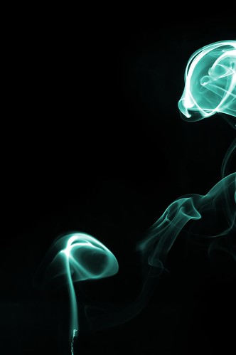
This has yet been another interesting experiment for me. After all the fruit splashes, I feel much more comfortable working with my flash. With a lot of questions in my mind have been answered with more experience under my belt, I decided to give the smoke shots a try. To my surprise, it's much easier to get good results than I originally anticipated. Here are some of the tips for you if you want to try shooting them at home. :)

Equipment required besides your camera:
  • Tripod (yes, this is a must, no excuse),
  • off camera flash sync. cable,
  • candle holder (or anything you find that holds your candle),
  • lighter (easier to work with than matches),
  • Remote shutter cable, or a IR remote to your camera (come on it's cheap...),
  • Some kind of black backdrop
  • keep water or an extinguisher handy just in case... you're warned :)
With your camera positioned towards the candle or inscent secured on your tabletop, pre focus on the candle, and shoot with a small aperture. Smaller aperture allows you to have a deeper depth of field, and thus have more of the smoke in focus. Set up your flash sync cable with your flash, and set it near the candle on the side, aiming towards where the smoke would be going. Set up your black background behind the entire setup, and position it with a generous distance so that the flash will not light up the backdrop. Turn off all the lights, close your windows, turn off your fan/AC to limit air flow.

The smoke I shoot is simple candle smoke that appears after the candle is put out. I simply blow at the candle to put it out. The color is added on with a simple Photoshop adjustment layer afterwards. It will take you 10 seconds to do a color if you know what you're doing. I'm not going to take your hand and walk you through since it's a little beyond the scope of this tutorial.

Once you have that set up properly, fire a couple test shots first to check the flash output. Pay attention to the background and see if it's pitch black. If your backdrop is catching light, find a way to restrict the flash and direct it to project where you want it to. If you're getting lens flare, chances are your flash is directly shooting at your lens. Find something to block your camera from seeing flash at all, and that would be easily solved.

Try to vary your flash output and ISO to get a balance of the setup. I use ISO 400 and have my SB600 set to -1.0 with F/22 and the smoke exposes perfectly. Once you think you captured enough, simply drop over to your photo editing program and clean up the image a little bit. Sometimes you may see small dust particles or spots, just use a clone tool or a healing brush to take care of it. The white background is achieved simply inverting the picture. Easy enough? Once you get a hang of it, just shoot a ton of them and let your creativity go wild. :)

Be safe, and have fun!

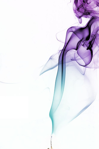
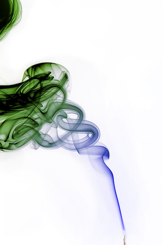
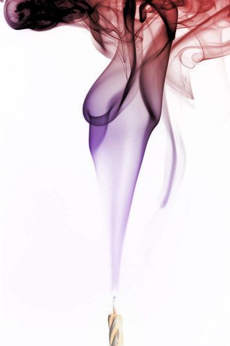
Some more shots I've done, click to enlarge / see more.

Smoke Abstract 1.13 (by hermanau)

Smoke Abstrat 1.10 (by hermanau)

Smoke Abstract, my first attempt (by hermanau)

Smoke Abstract, Rose (by hermanau)

X-Ray of a Dog? (by hermanau)

Friday, April 20, 2007

FixNEF, yes seriously, Fix your NEF!

Huge props to Jaewook Chung writing both programs... this one is probably even better than PreviewExtractor of the previous post. Wow, even taken those pictures that the WB is so messed up that you would have to spend an hour in PS just trying to correct it and eventually fail? Now this tool is here to the rescue... It appears to have a smarter algorithm in correcting white balance, and it modifies your NEF (RAW) file so that you wouldn't have to deal with jpeg loss. The only downside to it? You need Nikon Capture to use in conjunction with it in order to obtain the values you need. Also, too bad it doesn't support my old D50... :P D70, D2X owners, whee! Download the tool here.

Friday, April 13, 2007

Tutorial: Adobe Photoshop basics - Levels

I browse about 100-400 pictures / day on flickr, and I notice a lot of pictures out there are underexposed or overexposed. The truth is, if a picture is overexposed, there really isn't much you can do to save it; but if it's underexposed, you have a pretty good chance of saving it. To understand this, you have to understand how your digital sensor works. It works much like film in this case: When there's too much light exposed to your sensor for too long, it exceeds its capability to pick up any color information, and as a result, it turns into 100% white. We call that a blown-out spot. There are times when it is intentional to leave some spots blown-out in order to allow proper exposure to happen in other areas in a picture, but in general it is not desirable. If you shoot in RAW format, you still have a chance to adjust it when you process the picture. But before I lose you, let's go back to the subject and talk about underexposure.

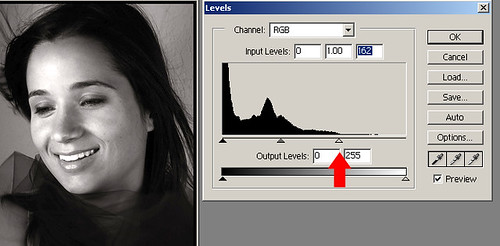
Below is a typical underexposed picture, but not by far. It's not a subjective thing, but is actually factual that you can see from the levels histogram as shown below:

teeth_blownout
Notice the histogram does not stretch all the way to the end, but rather lies from left to right about 65% of the way. In order to fix this and properly expose this picture, you should theoretically slide the right arrow to the end of the histogram, thus telling your photo editing program that the brightest spot of the picture is... right there (where the red arrow shows). Let's put it in a different way so you understand this better: You're basically telling the program that you want to discard anything on the right of the histogram, in this case almost nothing, and use where that arrow points as the brightest spot in the picture.

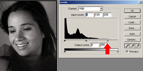
Before we move on, look at the picture once again, and notice the teeth of the beautiful lady in the picture is unfortunately blown-out! Right... you just told the picture to set the brightest spot, and hey Herman you messed up the picture! Ahem... that's why I said theoretically earlier! In most cases you should do that, but in this image, nope! The image was shot with a pretty strong light source somewhat facing the lady's face, and her teeth unfortunately caught more light than the rest of the face, and it became the brightest spot in the image. Sure there are a lot of ways to fix this, but let's stay with the basics this time. What we're going to do here is to ease up the earlier adjustment to what's shown below:

teech_okay (by hermanau)

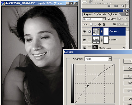
Ahha! better... the face looks more natural, although not perfectly exposed. Now that you know that you have definitely improved the image, but not exposed it perfectly just yet. We're going to try the curves tool to bring up a little bit more light around the mid-tones, while leaving the brightest spots (the teeth, for example) alone. Look at the image below again:

curves_all (by hermanau)

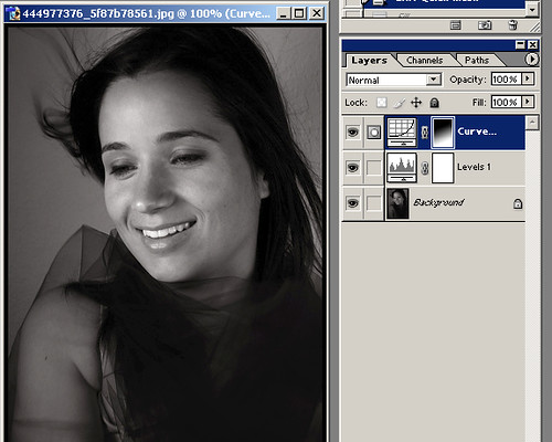
Yay it's coming along... but it looks too bright again, particularly in the facial area. Correct, and this is how we're going to fix this final part of the image. We're going to tell the program that we want this effect that we just did, but only apply it fully at the bottom of the screen, and gradually blend into almost no adjustment towards the top of the head, in a sense that the face wouldn't catch too much of the ill-effect we just did. What we'll do is to click on the mask of the adjustment layer we just did, and draw a gradient from lower right to upper left in white to black seen below:

curves_masked (by hermanau)

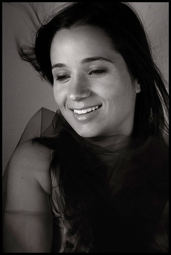
Tada! That's it and we're done! Before you quickly save it and upload it to flickr, please listen to me before you wrap it up. Remember you're trying to enhance the image, not alter it dramatically here. Your adjustments MUST be gradual in order to maintain subtleness. Remember you don't want to be seen over-adjusting, and you want to always go back and forth to compare the before and after picture and see if you really improved it, or if you actually made it worse! Here's a quick comparison of the before and after shot.

Emile (by .Hortencia.Caires.)finished (by hermanau)

Recap: We used the levels tool to better expose the shot, then we used the curves tool to bring out the mid-tones, and finally used a layer mask to mask off some of the effects of the curves tool to avoid making the face too bright. Questions, suggestions, feel free to exercise your freedom of speech! ;-)


Credits: Big thanks to .Hortencia.Caires. on Flickr for allowing me to use her beautiful picture as an example here!

Additional notes: A reader asked me to explain further about the histogram on Efania and I decided to post it here too:


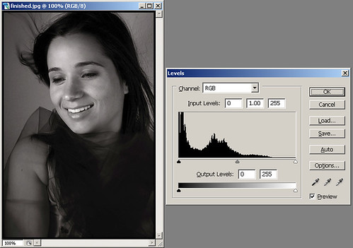
I'm glad you asked because I was afraid I'll lose most readers if I explained too much in depth. The x-axis of the histogram represents from left to right, complete darkness to complete brightness. The y-axis represents the amount of pixels. in this example it's showing RGB meaning Red/Green/Blue channel, but since this is a b/w image it's only representing luminance, or the amount of light.

histogram (by hermanau)

In this above example, translating into plain English:
There's a lot of complete darkness, mostly in her clothings in the lower right of the full image, some in the hair. At around 25% to 50% of the x-axis we've got quite a bit of information too, representing the darker gray tones of the picture: part of her face, her arms, the background; the rest of the information from 50% to 75% or so which has only quite a few pixels the bright part of her face; and finally there are no pixels from 75%-100% brightness int he image, meaning it's under exposed. But in reality, since we want to avoid properly exposing the entire image resulting in the teeth overexposing, we resorted to using the curves and a layer mask to selectively bring out more details of the significant part of the image and leaving the original feel of lighting intact.

Hope I explained this better this time... :-)

Afterwods: If I were adjusting this image myself, I would probably try to isolate the teeth and part of her forehead using a layer mask made in combination of magic wand, gaussian blur, paint brush / quick mask to make it closer to perfect. But we'll probably save it for later... :-)

Wednesday, April 11, 2007

HDR Tutorial with Photomatix and Photoshop

Forewords: I hated HDR. Why am I even bothering with it and writing this? It's only because there are too many that really give HDR a bad name, and I finally got around and decided to learn how to do it well myself. I'm not claiming to be an expert in this and I'm only sharing what I've learned so far.

Preparation: First off, you need an HDR software to make HDR shots. There are lots of HDR softwares out there on the market, and Photomatix is a popular choice and is what I used in mine. I believe Photoshop CS and above has the HDR feature if you already have a copy. Second of all, you need a tripod. This is very important because in order to generate a good HDR you'll need multiple shots of different exposure. You can generate HDR with 1 picture, but you wouldn't get a very good one and take the most advantage of it.

Before you start, you may consider briefly reading what HDR is really all about, what the results should look like, and what you want to achieve before you proceed. Here's a pretty good site for your reference: Cambridge in Colour


Step 1: Taking the shot:
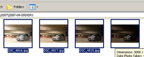
First off, identify your subject. Find something with a wide variety of range in lighting. e.g. sunset silhouette; shooting from inside a building with windows in the middle of the day; parking lot at night. Also, make sure you find something that stays still and does not move. Set up your tripod, and then you'll be off to take multiple images. You can either use the bracketing feature of your camera, and if it's not available, manually take multiple shots of the same white balance, aperture, but vary the exposure. I did mine using different shutter speed in Manual mode shown above.

multi_exposures

Take at least 3 shots, and review your shots. For best results, make sure your different shots cover a wide range of exposure of different parts of the picture.

Step 2: HDR processing:
This tutorial is not meant to give you a step by step tutorial on how to use your HDR software, and thus I'll try to cover the broader basics of what you'll encounter and prepare you with the information you need to get it done.

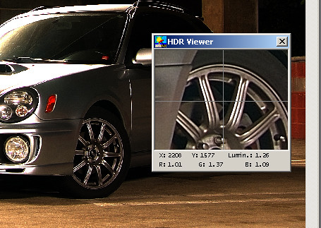
Open up your HDR software, and use it to open up all the images you have taken. Follow the instructions and start generating your HDR! (For Photomatix users, Click HDRI, -> Generate HDR).
When you're done, you'll see something like the following picture, YUCK!
tone_mapping (by hermanau)

Don't be discouraged yet like I was... :-) We're just beginning and this is only a part of the process. Review the image, and check for ghosting effects or visual blemishes. If you spot ghosting, chances are your camera moved when you're shooting, or your shots need to be aligned. In that case, you may have to go back to step 1 or try the aligning image feature of your software if it's available.

Step 3: Tone Mapping:
In Photomatix you'll see that little window hovering, and that's a preview window of what it could look like when you adjust it properly. The large preview window is only giving you an idea of the range of the image, and by no means it is going to be the final product. Then, go to HDRI -> Tone Mapping and adjust the settings to your preference. Experiment with the settings to your liking, but make sure you don't go too extreme here. You want to enhance the picture instead of generating a plastic wrapped 3D'ish looking piece of duno-what-you-call-it like a lot of those HDR-wannabes out there. This is where I can't really share much with you at this point because I'm not exactly an expert. But I'm sure you'll find a ton of reference out there that will assist you in this process. This is a process with many different approaches, and you'll have to master this if you ever wanted to get your HDRs right.

When you're done in this step, you'll be having an HDR image (yay!), but we're not done yet (duh!). Think of it this way, your HDR is like a RAW file that contains much more information about each pixel than necessary to dispaly on your monitor. Why? That's because when you're done, you'll be converting this 24-bit or even 48-bit HDR image back into an 8-bit LDR format, discarding the unused information. Save your image in 48-bit format to retain all the information you have created in the process in TIFF.

If you're a Photoshop user, you may skip the tone mapping in your HDR software and covert the HDR image into LDR in here. In that case, you'll notice a lot of tools normally available to you in Photoshop or the photo editor of your choice are missing when you open the 48-bit TIFF. You'll have to change it back to an 8-bit or 16-bit image before you can regain all the tools.

This is the step a lot of people skip, and fail miserably in their HDR resulting in a flat, overexposed, plastic wrapped like image. I can't stress enough in my tutorials about this, but remember you're trying to enhance the image instead of trying to create something from scratch when you retouch an image. HDR is no different from any photo retouching process, and could be very destructive if you go overboard.

Step 4: Post Processing:
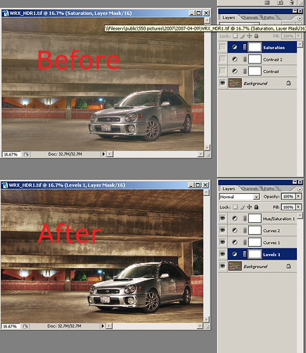
Now, open up your newly generated HDR image with your editor (Photoshop, in my example). What I tried to do here with my image is to #1 reduce the color over saturation, #2 bring back some of the contrast lost in the process. See the image below:

photoshop_editing (by hermanau)

I've applied Levels to first correctly expose the image, stretching the sliders on both ends to the histogram. Then I applied 2 different curves to the image to adjust the contrast of the image, and to bring out the details I wanted. Finally, adjusted the saturation down by a lot, yes a LOT... saturation makes beautiful colors, but over saturation results in loss of range of color and can be very destructive also. The results... you be the judge. :-)

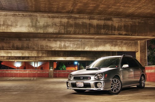
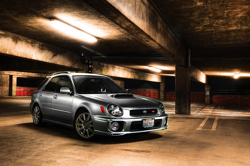
Subaru WRX (by hermanau)
Final Result


Subaru Impreza WRX (by hermanau)
Another recent shot... Better looking? ;")


Finally, I have a few tip for you all if you are new to making better HDR shots:

  1. An masterfully processed HDR shot would be a piece of crap if the shot itself is bad. Keep that in mind and watch your composition, focus, sharpness, noise, angle, etc.
  2. Know what HDR does for you, and use it to your advantage; not to your disadvantage. HDR stands for high dynamic range, and it's basically stacking the same image of different exposures in order to better achieve the ideal exposure that cannot be captured in one single shot. Before you run outside holding your camera, think in your head what would be underexposed and overexposed if you shoot there, that time of the day. There are good times, locations, and lighting environment where HDR truly shines.
  3. Bright daylight where pretty much everything in your frame other than your wheels and your undercarriage is brightly lit has minimal for you to enhance.
    tip: Night shots with multiple light source results in amazing results if done right.
  4. Shoot RAW. Don't argue with this one... just do it.
  5. Shoot with a tripod, always. If you're serious about photography, invest in a better tripod and spend at least $150 or more for a decent one.
  6. Color balance is extremely important in HDR. Make sure you don't end up with multiple shots of different color balance and end up with a weird image.
  7. Shooting the image, combining them in PS/Photomatix, etc, and Tone Mapping is only HALF WAY OF THE PROCESS! I'M SERIOUS. You should spend at least the equal amount of time or MORE in post processing to finish editing the image. The unbelievably great looking HDR images you see do not come out straight from just Tone Mapping.
  8. Last but not least, always go back and compare it with the original shot, and I mean it. The HDR process is not supposed to create a silly halo effect that looks plastic paint. It's a treatment to achieve the ultimate surreal exposure that not even our amazing human eyes could do. Make sure your treatment and post processing is doing something constructive, instead of making it worse than it originally looked before the process.
Hope it helps.

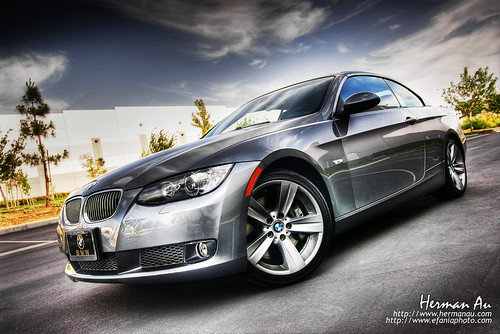
BMW 335i Convertible (by hermanau)

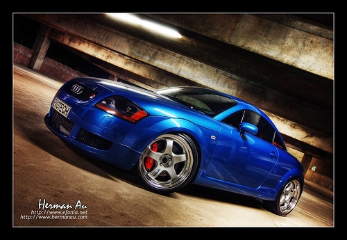
Denim Blue Audi TT Coupe (by hermanau)

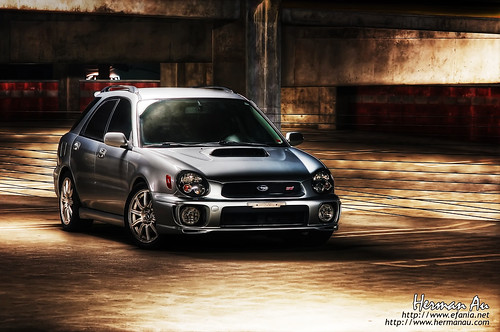
HDR WRX STi Wagon (by hermanau)

Wednesday, April 04, 2007

FREE Lens Hood

The best word of the Internet is, without a doubt, FREE

I was cleaning up my emails earlier and found this great site for the fellow photographers who may want a Free lens hood, printed directly from your own printer. Sure they're made of paper and aren't as durable as the real thing, but it's FREE comparing to spending $40-$50 for a piece of plastic that occupies space in your camera bag. I'm sure we can all save a little money for that other lens on our list... ;-)

Oh, and here's the link to your FREE paper lens hood. :-)