Forewords: I hated HDR. Why am I even bothering with it and writing this? It's only because there are too many that really give HDR a bad name, and I finally got around and decided to learn how to do it well myself. I'm not claiming to be an expert in this and I'm only sharing what I've learned so far.
Preparation: First off, you need an HDR software to make HDR shots. There are lots of HDR softwares out there on the market, and Photomatix is a popular choice and is what I used in mine. I believe Photoshop CS and above has the HDR feature if you already have a copy. Second of all, you need a tripod. This is very important because in order to generate a good HDR you'll need multiple shots of different exposure. You can generate HDR with 1 picture, but you wouldn't get a very good one and take the most advantage of it.
Before you start, you may consider briefly reading what HDR is really all about, what the results
should look like, and what you want to achieve before you proceed. Here's a pretty good site for your reference:
Cambridge in ColourStep 1: Taking the shot:
First off, identify your subject. Find something with a wide variety of range in lighting. e.g. sunset silhouette; shooting from inside a building with windows in the middle of the day; parking lot at night. Also, make sure you find something that stays still and does not move. Set up your tripod, and then you'll be off to take multiple images. You can either use the bracketing feature of your camera, and if it's not available, manually take multiple shots of the same white balance, aperture, but vary the exposure. I did mine using different shutter speed in Manual mode shown above.

Take at least 3 shots, and review your shots. For best results, make sure your different shots cover a wide range of exposure of different parts of the picture.
Step 2: HDR processing:
This tutorial is not meant to give you a step by step tutorial on how to use your HDR software, and thus I'll try to cover the broader basics of what you'll encounter and prepare you with the information you need to get it done.
Open up your HDR software, and use it to open up all the images you have taken. Follow the instructions and start generating your HDR! (For Photomatix users, Click
HDRI, ->
Generate HDR).
When you're done, you'll see something like the following picture, YUCK!
")
Don't be discouraged yet like I was... :-) We're just beginning and this is only a part of the process. Review the image, and check for ghosting effects or visual blemishes. If you spot ghosting, chances are your camera moved when you're shooting, or your shots need to be aligned. In that case, you may have to go back to step 1 or try the aligning image feature of your software if it's available.
Step 3: Tone Mapping:
In Photomatix you'll see that little window hovering, and that's a preview window of what it could look like when you adjust it properly. The large preview window is only giving you an idea of the range of the image, and by no means it is going to be the final product. Then, go to
HDRI ->
Tone Mapping and adjust the settings to your preference. Experiment with the settings to your liking, but make sure you don't go too extreme here. You want to enhance the picture instead of generating a plastic wrapped 3D'ish looking piece of duno-what-you-call-it like a lot of those HDR-wannabes out there. This is where I can't really share much with you at this point because I'm not exactly an expert. But I'm sure you'll find a ton of reference out there that will assist you in this process. This is a process with many different approaches, and you'll have to master this if you ever wanted to get your HDRs right.
When you're done in this step, you'll be having an HDR image (yay!), but we're not done yet (duh!). Think of it this way, your HDR is like a RAW file that contains much more information about each pixel than necessary to dispaly on your monitor. Why? That's because when you're done, you'll be converting this 24-bit or even 48-bit HDR image back into an 8-bit LDR format, discarding the unused information. Save your image in 48-bit format to retain all the information you have created in the process in TIFF.
If you're a Photoshop user, you may skip the tone mapping in your HDR software and covert the HDR image into LDR in here. In that case, you'll notice a lot of tools normally available to you in Photoshop or the photo editor of your choice are missing when you open the 48-bit TIFF. You'll have to change it back to an 8-bit or 16-bit image before you can regain all the tools.
This is the step a lot of people skip, and fail miserably in their HDR resulting in a flat, overexposed, plastic wrapped like image. I can't stress enough in my tutorials about this, but remember you're trying to enhance the image instead of trying to create something from scratch when you retouch an image. HDR is no different from any photo retouching process, and could be very destructive if you go overboard.
Step 4: Post Processing:
Now, open up your newly generated HDR image with your editor (Photoshop, in my example). What I tried to do here with my image is to #1 reduce the color over saturation, #2 bring back some of the contrast lost in the process. See the image below:
")
I've applied Levels to first correctly expose the image, stretching the sliders on both ends to the histogram. Then I applied 2 different curves to the image to adjust the contrast of the image, and to bring out the details I wanted. Finally, adjusted the saturation down by a lot, yes a LOT... saturation makes beautiful colors, but over saturation results in loss of range of color and can be very destructive also. The results... you be the judge. :-)
")
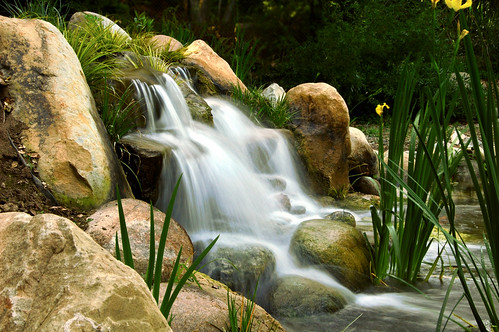
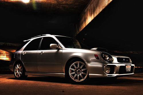
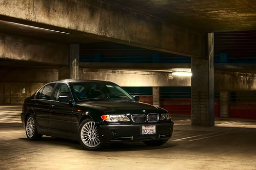
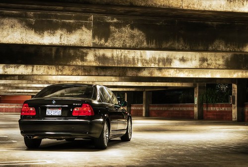
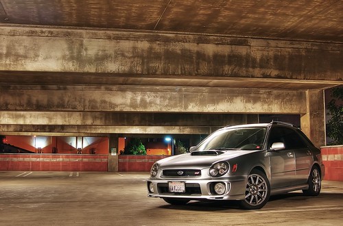
Final Result
")
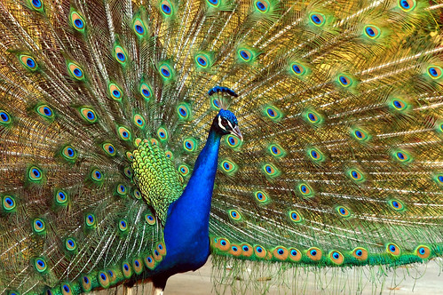
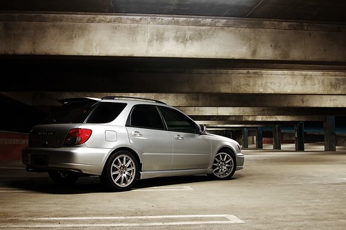
Another recent shot... Better looking? ;")
Finally, I have a few tip for you all if you are new to making better HDR shots:
- An masterfully processed HDR shot would be a piece of crap if the shot itself is bad. Keep that in mind and watch your composition, focus, sharpness, noise, angle, etc.
- Know what HDR does for you, and use it to your advantage; not to your disadvantage. HDR stands for high dynamic range, and it's basically stacking the same image of different exposures in order to better achieve the ideal exposure that cannot be captured in one single shot. Before you run outside holding your camera, think in your head what would be underexposed and overexposed if you shoot there, that time of the day. There are good times, locations, and lighting environment where HDR truly shines.
- Bright daylight where pretty much everything in your frame other than your wheels and your undercarriage is brightly lit has minimal for you to enhance.
tip: Night shots with multiple light source results in amazing results if done right. - Shoot RAW. Don't argue with this one... just do it.
- Shoot with a tripod, always. If you're serious about photography, invest in a better tripod and spend at least $150 or more for a decent one.
- Color balance is extremely important in HDR. Make sure you don't end up with multiple shots of different color balance and end up with a weird image.
- Shooting the image, combining them in PS/Photomatix, etc, and Tone Mapping is only HALF WAY OF THE PROCESS! I'M SERIOUS. You should spend at least the equal amount of time or MORE in post processing to finish editing the image. The unbelievably great looking HDR images you see do not come out straight from just Tone Mapping.
- Last but not least, always go back and compare it with the original shot, and I mean it. The HDR process is not supposed to create a silly halo effect that looks plastic paint. It's a treatment to achieve the ultimate surreal exposure that not even our amazing human eyes could do. Make sure your treatment and post processing is doing something constructive, instead of making it worse than it originally looked before the process.
Hope it helps.
")
")
")
 hdr
hdr


")
")
")
")
")
")


")


